Eight years ago, the United States economy was in the throes of its largest recession since the Great Depression. The U.S. housing market was in severe decline. In the years before the crisis, banks had facilitated the explosion of “subprime” mortgage lending whereby borrowers with poor credit history were offered mortgages they couldn’t dream of repaying. Eventually, the U.S.’s housing bubble burst and evictions, foreclosures, and prolonged unemployment rose across the country. Even Wall Street’s biggest firms were not immune to the fallout from the housing market's collapse. Many banks had packaged these subprime mortgages together into collateralized debt obligations (CDOs) and traded them as securities. As soon as the real estate market took a turn for the worst, so too did the finances of banks holding large amounts of CDOs.
Eight years and a financial stimulus package later, I started to wonder how the U.S. housing market was doing today. As a soon-to-be college grad, I had heard plenty about the exorbitant monthly rents facing tenants in New York and San Francisco. I had even heard rumors that it might be less expensive to commute to San Francisco four times a week from Las Vegas than live in SF. From all anecdotal indications, the real estate markets in two major U.S. cities seemed to be booming. But what about the rest of the country? Even as recently as May 2015, the Detroit News wrote that the volume of unoccupied homes in the city was “absolutely terrifying.” In Las Vegas, the foreclosure rate still well exceeds pre-crisis levels. So was the real estate recovery only happening in select pockets with thriving economies? Or was the recovery more widespread?
To analyze the current state of the U.S. housing market, I decided to use data pulled from the real estate website, Trulia. Through its API, Trulia offers aggregated data about the median listing price of real estate in a given state, city, or even neighborhood. The data accessible through the Trulia API stretches back to July 2009, meaning that I could feasibly analyze housing market developments since the end of the financial crisis. After pulling in data from the API, I imported it to Tableau. The following data visualizations speak to a recovery in real estate that is progressing but far from over.
A State-Level View of the Real Estate Recovery
I started by looking at month-over-month changes in median listing price at the state level. Note that the listing price of a property is the price at which a seller offered the property on the Trulia platform, not necessarily the final price at which it was sold. Even so, median listing price provides a strong indication of housing market health. Sure, sellers often list their property at a price slightly higher than its true market value, in hopes of deriving a little surplus in the sale. But we should expect most sellers to take this approach across time. So long as this bias is equally prevalent at an aggregated level across months, median listing price should offer an effective way of tracking the directional trend of real estate prices.
The map below shows the trend in real estate prices by state since mid-2009. Note that the percentage change for a given month is calculated relative to July 2009—that is to say, if the median listing price for a given state was $300,000 in July 2009 and drops to $240,000 in a subsequent month, the change in median listing price will be reflected as -20%. For that month, the state will be colored red on the map. Darker shades of red indicate more significant drop-offs in median listing price; darker shades of green indicate larger increases.
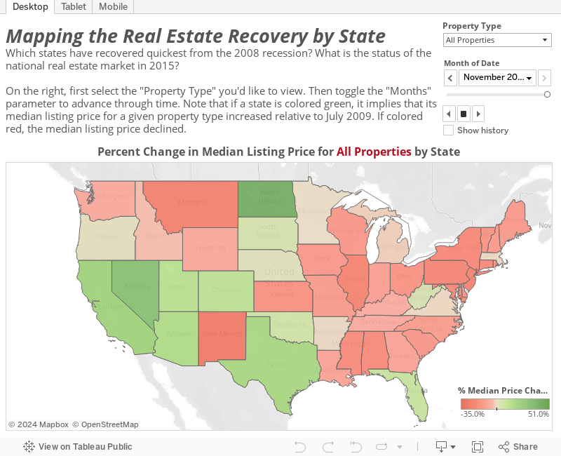
A few interesting insights derived from this visualization:
- Although the National Bureau of Economic Research declared the financial crisis over by June 2009, the housing market didn’t immediately rebound. In fact, the vast majority of states were still suffering from depressed listing prices across property types through the end of 2013. Even six years removed from the end of the crisis, some states—a higher proportion in the Midwest, South, and Northeast—were still down relative to July 2009.
- Some states did recover quicker than others. California and Nevada, for instance, seemed to be among the recovery frontrunners. Median listing prices for 2 and 3 bedroom properties turned positive in those two states by the summer of 2013 and only rose from there. Perhaps the most surprising development was the strength of North Dakota’s turnaround. By July 2012, the median listing price of a 4 bedroom property in North Dakota was 13.1% higher than in July 2009, well ahead of any other state. This is likely a sign of the fracking industry’s growth and the fact that families were moving to North Dakota to take advantage of it.
- Finally, the speed of recovery also differed by property type. By June 2014, median listing prices on 4 bedroom properties had surpassed July 2009 prices in 19 states. The same can only be said of 2 bedroom properties in 5 states—California, Nevada, Colorado, North Dakota, and Hawaii. Why prices seemed to rebound more quickly for larger properties is an empirical question that would require deeper analysis. It could be because the types of people able to afford bigger homes were less affected by the financial crisis, ensuring a smaller dip in demand. Alternatively, the financial crisis could have curtailed larger construction projects, artificially limiting the supply of big homes. Of course, both of these explanations are pure speculation.
The Recovery in Metropolitan Areas
Next, I wanted to take a closer look at how the financial crisis affected housing prices in major metropolitan areas. I pulled data from the Trulia API on the median listing price for each major city within the U.S.’s 50 largest metropolitan statistical areas (MSAs). The graph below shows the percent change in median listing price for these cities since July 2009. In the analysis that follows, I’ve always set property type to “All Properties” to avoid any confusion. I found that limiting the data to a single property type (i.e. 1 bedroom properties) at the city level, while interesting, can occasionally be too volatile to decipher.
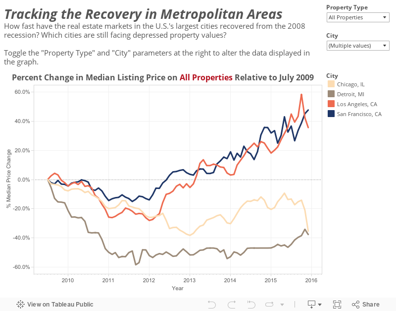
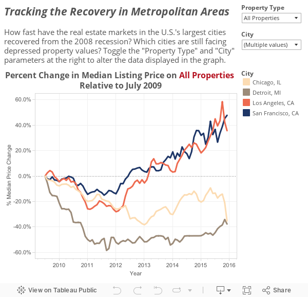
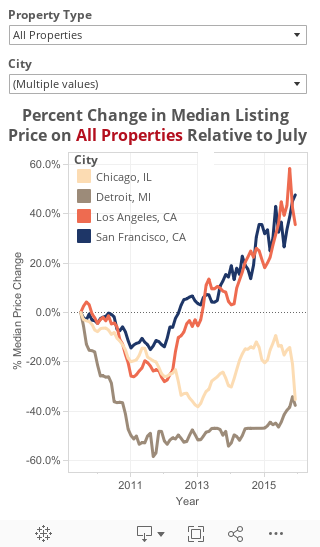
At first blush, the recovery on a city level seems to generally have followed the same trajectory as on the state level. Median listing price declined across the vast majority of cities until at least the summer of 2012, when the housing market started showing a little more vitality. There are some interesting exceptions, however. Buffalo and Miami were both showing strong upswings in listing prices by the middle of 2011, albeit for different reasons. Buffalo’s housing market barely suffered any sort of setback in light of the recession; unemployment remained low and the foreclosure rate was nearly 7x less than the national average in December 2010. In contrast, Miami’s housing market dipped at first, but recovered quickly on the back of substantial foreign investment.
Other cities, however, weren’t so lucky. As the above graph demonstrates, the number of cities that have yet to fully recover from the crisis is startling. Of the 50 cities represented in the data set, 18 of them reported a median listing price for July 2015 below that of July 2009. It seems that housing markets across the Midwest have been hit especially hard in the post-recession period. For much of this time, Detroit saw the largest housing decline of any city, with a median listing price hovering around 50% below the mark set in July 2009. Yet, Detroit’s problems are not isolated. Seven of the nine other Midwestern cities in the data set also saw listing prices in July 2015 lower than July 2009 levels. Minneapolis and Indianapolis were the only two cities that experienced even modest price increases relative to six years prior. The downturn in median listing prices across the Midwest is likely due to the strain placed upon the farming sector and heavy industry by the financial crisis.
Meanwhile, some cities have witnessed solid growth in housing prices since 2012. All five cities in California—Los Angeles, San Francisco, San Jose, San Diego, and Sacramento—have rebounded nicely relative in the past few years. So too have the four cities in Texas represented in the data set, namely Austin, Dallas, Houston, and San Antonio. New York also stands out as the city with the highest growth in median listing price since July 2009. Although California, Texas, and New York are geographically separated, their housing markets have benefitted from similar economic conditions. Each is home to one or several burgeoning industries—tech, energy, and/or finance.
How Expensive is a Home in a Given City?
As a second-semester college senior, I’m still probably a few years (and more than a few paychecks) from buying my first home. Still, I thought it’d be interesting to compare major U.S. cities in terms of the current affordability of their housing. The following bar chart compares the median listing price observed on Trulia in a given month across the 50 cities in my data set.
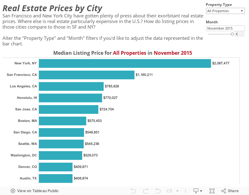
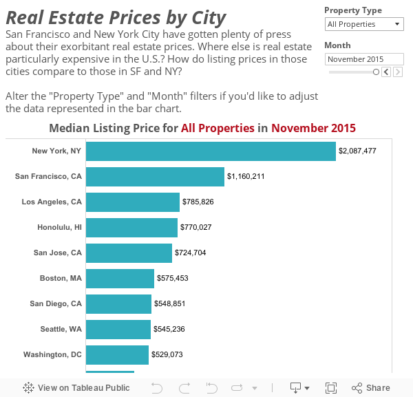
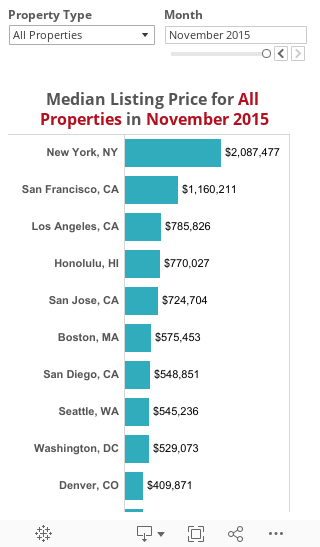
Unsurprisingly, listing prices in New York and San Francisco far exceed those seen around the rest of the country. It’s interesting, however, that New York seems to be more expensive than San Fran across all property types dating back to July 2009. It also appears as though the price gap between comparable New York and San Francisco homes becomes larger as the number of bedrooms increases (compare the above chart when “Property Type” is set to “1 Bedroom Properties” then “5 Bedroom Properties”). This seems to contrast with some reports that have San Fran’s real estate market becoming more expensive than the Big Apple’s in 2014. Note, however, that these reports focus on the fact that San Francisco rent is higher than that of a comparable New York apartment. The Trulia data represented here is for median listing price, meaning all these properties were actually being sold. Therein lies the difference; while San Francisco rents may have outpaced New York’s, it still seems more expensive to buy a place in NY.
As of November 2015, nine of the ten most expensive cities across all property types were located on a coast. Denver was the only exception, sneaking in with the tenth highest median listing price during that month. The more affordable cities are generally clustered in the middle of the country. Housing is cheap in places like Ohio; of the three Ohio cities represented (Cincinnati, Columbus, and Cleveland), none crack the top 30 most expensive cities as of November 2015. Perhaps the starkest example of affordable housing in middle America comes from Detroit. In every single month since July 2009, Detroit has had the lowest median listing price of any city across all property types. Shockingly, the price of one bedroom homes has remained higher than even five bedroom homes for the majority of this timeframe. Why? Because so many larger, family-style homes have been foreclosed since 2009 that they’re going for pennies on the dollar.
The U.S.’s "Bougiest" Neighborhoods
Finally, I wanted to zero in on home prices within metropolitan neighborhoods, to get a sense of which were America’s “bougiest” locales. I pulled data from Trulia at the neighborhood level for five cities—New York, San Francisco, Los Angeles, Chicago, and Philadelphia. I aggregated the data by year, averaging the median listing price across the 12 months in a given year. This was done to avoid situations where the sample size for some neighborhoods was too small.
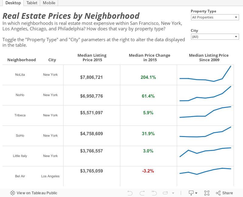
A few key takeaways:
- It comes as no shock that New York has some of the ritziest neighborhoods in the country. Median listing prices on properties in Manhattan’s NoLita, NoHo, Tribeca, SoHo, and Little Italy were the five highest of all neighborhoods represented. And even on a neighborhood level, real estate prices are obviously increasing; of the 38 New York neighborhoods included, only three—Harlem, Washington Heights, and Tudor City—witnessed a decrease in median listing price in 2015.
- Although housing in San Francisco as a whole is more expensive than Los Angeles, that doesn’t mean its bougiest neighborhoods are. In fact, five of the six most expensive neighborhoods between the two cities are located in LA. Bel Air, Beverly Hills, Pacific Palisades, and Beverly Glen all had a median listing price above $3,000,000 in 2015; Presidio Heights was the only neighborhood in SF that could say the same.
- Even Chicago and Philadelphia’s ritziest neighborhoods are substantially more affordable than almost anything available in the three other cities. Neither Chicago nor Philadelphia had a neighborhood in which median listing price was above $700,000 for 2015.
Conclusion
Let’s return to our motivating question: has the U.S. housing market fully recovered from the recession? I would say the answer is mixed. On the one hand, real estate prices in certain parts of the country have soared since 2012. It’s largely metropolitan areas along the coasts that have experienced this growth, particularly cities like San Francisco and New York. On the other hand, housing prices in much of middle America still seem to be depressed even eight years after the financial crisis. Detroit continues to serve as the harshest example of this phenomenon. So we’re left with an American housing market that is at a crossroads—on the mend, but not fully recuperated.
