Client Work Case Study
Retirement Security Report 2021
Background
Equable’s Retirement Security Report is an annual initiative that analyzes public retirement plans across the U.S. to determine if they are providing adequate paths to retirement income security. The report includes 345 plans in all 50 states (+D.C.) and is broken down by 11 metrics. We were tasked with building a page within Equable’s existing website that allows users to filter and compare plans in their state based on their occupation in the public sector.
Project Details
Client
Date
March 2021–June 2021
Audience
Public workers nearing retirement age or planning for it in the future.
solution
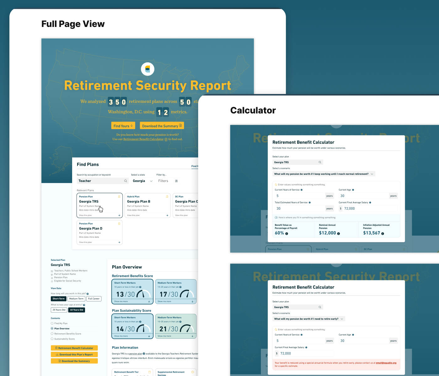
We developed an interactive website and report summary generator that dynamically populated information about the particulars of each retirement plan. Users could surface insights about their plan, including eligibility requirements, contribution rates, and any funding shortfalls. We also created a Retirement Benefit Calculator that allowed users to see how much their pension would be worth under various scenarios.
Result
The project was successfully launched after three months of collaboration between our internal team and Equable’s data experts. Because we elected to use a Google Sheet as a lightweight backend, Equable has been able to update the data underlying the tool numerous times without our help.
Project Goals
To help public workers better understand their retirement and pension benefits.
To assist public workers in choosing a retirement plan that works best for their needs.
To give public workers a more tailored experience around their retirement goals.
Research Methods
Data Sources
Equable collected information on 345 statewide retirement plans currently open to new hires. The information was gathered primarily via publicly available documentation like annual financial reports and member handbooks. Equable’s dataset includes four different types of plans: traditional pensions, defined contribution plans, guaranteed return plans, and hybrid plans. In total, these plans covered many different types of public workers, including elected officials, public school employees, public safety workers, and others.
For a complete view of Equable’s data, see this public Google Sheet.
Analysis
The Retirement Security Report assesses each plan in two ways:
- It offers a Retirement Benefits Score, which evaluates whether the plan places members on a secure path to retirement. For the purposes of its analysis, Equable defined adequate retirement income as reaching at least 70% of replacement of pre-retirement salary by age 67.
- It also offers a Sustainability Score, which assesses whether the plan is on a good financial trajectory that will allow it to meet its future commitments.
Plans could receive a maximum score of 30 for Retirement Benefits and 27 for Sustainability.
For more information on the analysis, see Equable’s official methodology and its scoring scripts on GitHub.
Design
We began designing the experience in March 2021. Our team spent the first week get acquainted with the data and knowledge requirements, so that we could ensure the tool conveyed the breadth of information in a clear and accessible way.
Concepting
To start, we focused on honing the site layout, testing different ideas with the client and looking at other interactive tools for inspiration. As we fleshed out the design vision further, we kept the following in mind. —>
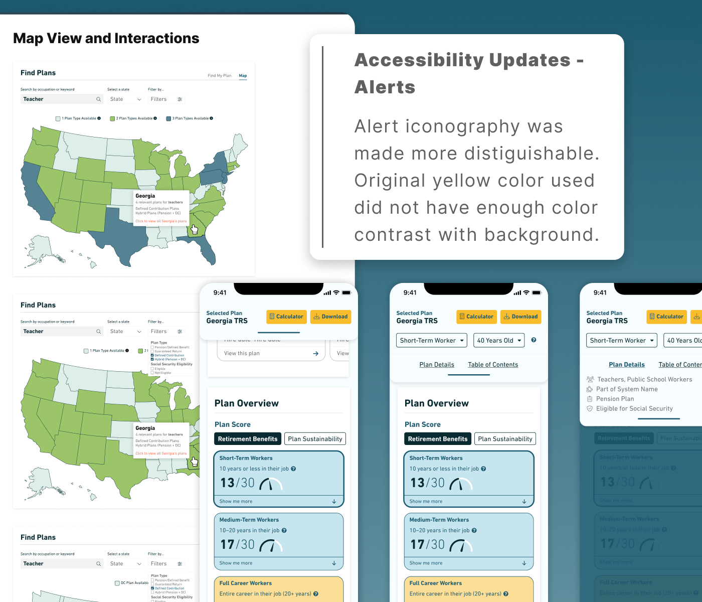
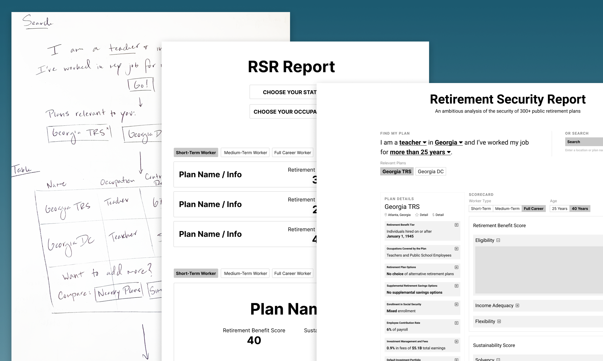
With these questions to guide us, we began wireframing the preliminary concept. We started with simple paper sketches, then moved into Figma once we’d agreed on the basic layout. We elected to give users two means by which to find their plan: 1) a map interface, where they could click on state and select from the state’s plans or 2) a list interface, where they could easily search and filter.
Once users selected a plan, they’d be scrolled down to the main content of the report. We arranged this content in a series of nested cards, which provided details about Equable’s assessment of the plan in a scannable format. We took great care to ensure that we used color and text hierarchies in a way that made the experience feel less overwhelming. For those that wanted a static summary of the content, we also provided the option to download a PDF printout for each plan.
What is the simplest way to help users find the plans they care about?
How can we make a dense, text-based experience easy to consume?
How can we cater the experience to those who are less tech savvy?
How can we account for those who may want to consume the information in static form?
Mockups
Once we’d honed the basic concept, we moved to higher fidelity mockups. The designs went through three rounds of revision, each followed by weekly client feedback. We adhered to Equable’s brand guidelines closely, so that the end result felt on brand and fit neatly within their site.
One main challenge we confronted while designing the mockups was how to use color in a way that was brand appropriate but also passed color contrast requirements. This especially became evident when designing the initial U.S. map view. To confront this issue, we conducted periodic accessibility audits using Figma plugins like Stark and Color Oracle to ensure that the data being presented met accessibility guidelines. We also needed to consider the weight and visibility of key interactive iconography for clarity of function.
By the end, we had a series of Figma prototypes that demonstrated the site’s aesthetic and functionality across desktop, tablet, and mobile.
Technology
The project’s frontend was built using Svelte, HTML, CSS, and vanilla Javascript. Data underlying the various visualizations and scorecards was pulled from a public Google Sheet.
To collaborate with Equable’s team and to make copy and data updatable and maintainable, we created a lightweight CMS using Google Docs, ArchieML, and Handlebars.
One of the bigger asks on this project was to make each plan’s report downloadable as a PDF. To do this on the fly, we created a series of PDF templates using InDesign and populated with copy, data, and charts applicable to each plan when a user pressed the download button. The outputted PDF document was dynamic and reflected the selected plan and applicable filters. We used Andrew Dillon’s pdf-lib library and some custom code to make this happen.
Development Workflow
Our team developed the digital experience in a six-week sprint. We checked in code via GitHub and spun up a password-protected test link using GitHub Pages for Equable to track progress.
Equable regularly compiled feedback on the test link via Google Doc, which we triaged and added to our task management system as we went.
Deployment
We worked with Marketing for Change — the agency that maintains Equable’s website — to deploy the project. They helped move our code to Equable’s servers and troubleshoot small bugs.
The project was released to the public on June 24, 2021.
Project Contact
Jack Beckwith
Contact Jack if you’d like to learn more about the project or ways that The DataFace can help your business.
(650) 353-0774